Here are the visual my group and I have made for the HARTS project. Since I am in the other classes we were creating visuals for my church site, Mulhenberg Activity Center. We came up with a list of visuals that will be present on the site to help aid the guests and volunteers at the site.

This is the kitchen map which includes many different colors and shapes to navigate the volunteers in the kitchen. The kitchen is clearly drawn out and then there is a key in the bottom left to explain what each part of the visual means. We included a, "you are here" label so that that volunteers do not get confused by the map.
 This orange signage is going to be placed in the kitchen. It shows the kitchen chores and when specific things should be done throughout the night.
 These are instructions for the convection oven. The instructions are placed in the bottom right corner in the same orange we have been using with pictures being highlighted with a blue border.
 This first image is the floor plan of the shelter site. It will be large and present on the wall within the multi-purpose room. We decided to use these complementary colors as a theme throughout all the visuals. The orange stands out against the blue and is easy to read.
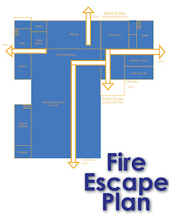 This is the fire escape plan that will be near the other larger floor plan. This is crucial so we did not want to make it very complex but we wanted to make it still visually appealing and understandable.
 The smoke break schedule is more about alignment and space. We used boxes to emphasis some of the text and then made it symmetrical towards the bottom with the cigarette visual in the middle which aligns with the text above.
The coffee maker instructions will be present on the wall next to the coffee maker for the volunteers to look at if they are unfamiliar with the appliance. We used previously taken pictures to instruct the learner on what steps to take in making coffee. Instructions are presented on the far right margin and the pictures are boxed in blue to match the heading and the theme of the other visuals.


The guests and volunteer enter signs are simple yet visually appealing based on their symmetry and color. The font is appealing while the size of the words are just big enough to read form afar.

The shower visual was created to inform the guests and volunteers that the showers are located upstairs. Again the blue and oranges compliment each other and the symbol of stairs and an upward area along with text to make the visual clear.

Although this shelter time schedule is wordy, it is what will work best at the site. To make it visually appealing we kept it with the blue theme and then bolded the times to make them the focal point. Also the boxes next to it can be used as check off boxes to check off when the activity is completed.
No comments:
Post a Comment