When looking up Anarchy, I came across the idea of lawlessness within a society. I used the bigger, thicker shaped stars in the top right corner to represent sometime of power. I then created lighter, smaller stars in the lower left and middle of the page. I used the bigger stars, and the smaller stars to represent groups, or families. The pink and black are very bright and harsh colors, while the light blue and light pink are less harsh and less noticeable.

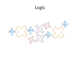
When I think of logic, I think of mathematics. I wanted to use the plus sign to create both plus signs and in a way multiplication signs. I grouped all the shapes that we angled and sized the same way, by color and or bevel. There is dysfunction along with order and similarities.

I thought that with intimidation I could be very literal, so that is what I did. I used the brace symbol to create forms that would be noticeable to all who would view it. I found myself creating these duck like forms and since intimidation is all about feeling threatened or fearful. The bigger duck sits on a bigger chair then the smaller blue duck.

When thinking about what shape to use for escape I instantly thought of doors. I liked how this shape looked like a door with the actual rectangle shape and the hinge on the side. The background is a wood texture that I found in Powerpoint in order to represent an actual door and escaping. I used the gradient tool on all of the so called doors and the brownish, gold color faces inward, outward, and towards the middle but all of the hinges are always facing inward. That is how I decided to group them from smaller, to larger.

I immediately thought of this design for isolation because I often think of a person in a dark room alone, lost and upset. I used a circle shape to create this body shape with a head, arms, shoulders, back, hips and legs. I used an all black background to represent a dark, isolated room and obviously grouped the shapes all together to create the body like figure in the corner.

For celebration I wanted to use bright, but not obnoxious colors. This double triangle shape I found really interesting but actually worked well for my design. The blues and purples were grouped together to over lap each other while the yellow shapes in the middle were stretched and altered and placed in the center of the entire figure.

Like many others I thought of a circle when creating an image about unity. The sun was the shape I chose to use in order to represent the world and nature and the way that we are all unified together. I then placed them in a circle in the middle of the page with changing shades of blue. The background is a warming purple color that has a fading affect that creates a white circle around and in the middle of the circle I created with the suns.
No comments:
Post a Comment