Thursday, February 23, 2012

Emphasis Assignment

Before:
After:

This is my before and after pictures for the emphasis assignment. I immediately thought of flowers in a field and having one of the flowers stand out against the rest. I took the original picture of tulips and selected one of the flowers. I then inverted the selection and adjusted the hue and saturation in order to make the single flower I selected stand out while the others were all the same. I like how the red line in the yellow tulip is accented from all the red tulips in the background. It seems to tie the picture together.

Tuesday, February 21, 2012

Repition and Visual Echo


In class today we working on a project that exhibited harmony. We were to pick a topic whether it be mathematics, science, language, etc and after picking our topic we were to decide on a concept to teach visually within that category. I decided to work on presenting the lesson of photosynthesis which falls under the science category and is clearly stated in my visual above.

I used repetition, or visual echo, when it came to the colors, as well as my use of arrows. I wanted the main picture of the flower to stand out by using visually appealing colors and then used shapes from Powerpoint to create the arrows, text and water droplets. I thought that it would be nice to use both Powerpoint and Photoshop for this assignment so that there was a range of symbols and shapes that I could work with.

I think that while there is a lot going on in the picture the concept is stated clearly and there is not to much clutter. Each word and arrow corresponding to that word and is grouped together in its appropriate place.

Wednesday, February 15, 2012

Grouping Challenge


I had a hard time coming up with the word that I wanted to use to describe myself. A lot of words I were thinking would work well and could be portrayed easily on a poster were not necessarily words that could describe someone. Then I came up with this idea. It can be thought of as many different answers but it all falls under the same category.
This is the final product that I came up with for this assignment. My picture is supposed to represent joy and that I am a joyful, happy, loving person who believes that you have to make yourself happy before anyone else can. After getting feedback from my class members, I decided to change a few things about my visual.

The first thing that I changed was the color of the quote. It was a light pink so I thought that making it a little bit darker but still corresponding with the hands pink tones, would look better. I then changed the color of the figure in the bottom left hand corner so that it was not so drastic in black and so that it would match also with the purple shades in the hand figure. I then found another sunset picture that I could use at the bottom of the screen instead of doing just a gradient scale for the background. This was one of the ideas of my classmates and I think that it works really well for the overall poster.


Grouping Activity


When looking up Anarchy, I came across the idea of lawlessness within a society. I used the bigger, thicker shaped stars in the top right corner to represent sometime of power. I then created lighter, smaller stars in the lower left and middle of the page. I used the bigger stars, and the smaller stars to represent groups, or families. The pink and black are very bright and harsh colors, while the light blue and light pink are less harsh and less noticeable.

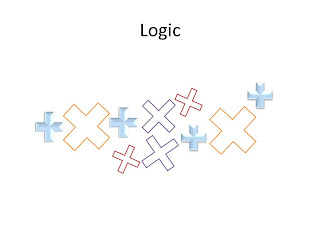
When I think of logic, I think of mathematics. I wanted to use the plus sign to create both plus signs and in a way multiplication signs. I grouped all the shapes that we angled and sized the same way, by color and or bevel. There is dysfunction along with order and similarities.

I thought that with intimidation I could be very literal, so that is what I did. I used the brace symbol to create forms that would be noticeable to all who would view it. I found myself creating these duck like forms and since intimidation is all about feeling threatened or fearful. The bigger duck sits on a bigger chair then the smaller blue duck.

When thinking about what shape to use for escape I instantly thought of doors. I liked how this shape looked like a door with the actual rectangle shape and the hinge on the side. The background is a wood texture that I found in Powerpoint in order to represent an actual door and escaping. I used the gradient tool on all of the so called doors and the brownish, gold color faces inward, outward, and towards the middle but all of the hinges are always facing inward. That is how I decided to group them from smaller, to larger.

I immediately thought of this design for isolation because I often think of a person in a dark room alone, lost and upset. I used a circle shape to create this body shape with a head, arms, shoulders, back, hips and legs. I used an all black background to represent a dark, isolated room and obviously grouped the shapes all together to create the body like figure in the corner.

For celebration I wanted to use bright, but not obnoxious colors. This double triangle shape I found really interesting but actually worked well for my design. The blues and purples were grouped together to over lap each other while the yellow shapes in the middle were stretched and altered and placed in the center of the entire figure.

Like many others I thought of a circle when creating an image about unity. The sun was the shape I chose to use in order to represent the world and nature and the way that we are all unified together. I then placed them in a circle in the middle of the page with changing shades of blue. The background is a warming purple color that has a fading affect that creates a white circle around and in the middle of the circle I created with the suns.

Thursday, February 2, 2012

Photoshop in class Assignment


This is the image that I created in Photoshop about myself. I chose a map of USA and highlighted the two states that I have lived in. I moved from CT to VA to attend JMU and will soon be graduating in May and now I am trying to figure out what it is I want to do now. This picture is supposed to represent that idea of me trying to figure out what is next. I used the transparency tool to add the map over the sky and grassy background.