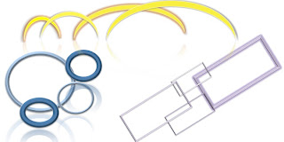

This is the before(right) and after(left) pictures. In this design we rotated the shapes, grouped by shape, and re-sized for consistency. I wanted to create something that looked cool but still kept each set of shapes apart from each other. I liked the bomarang shapes because I think they looked like smaller to larger arches. I used different bevel and shadow effects with the yellow half circles. The squares reminded me of frames so I put those together so that they almost made a rectangle when grouped together. The circles I sized to show repetition and I also used a shadow effect on those to reflect them.

On the poster assignment I wanted to make the words and picture stand out so I changed the background color to black. Then I took the colors from the watering can (purple and gold) and reflected that in the color in the writing, title, background title color, and lines. I used the lines in the middle of the page and the writing around it to stray the eye from the title, to the description, to the address and around the poster.
